Dziękujemy za
założenie konta.
Twój prezent
już do Ciebie leci!
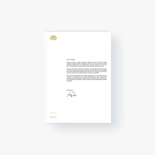
Letterhead Paper
Some product prices in cart have been updated according to the current discounts applicable for this account. Find the list of updated products below:

Dziękujemy za
założenie konta.
Twój prezent
już do Ciebie leci!
Some product prices in cart have been updated according to the current discounts applicable for this account. Find the list of updated products below:
Today, business correspondence takes place mainly online. This is obvious in the era dominated by digital communication. More special is a message sent in a palpable form, especially if it is written on carefully chosen letterhead stationery reflecting the nature of the brand.

Regardless of the text of the message, letterhead paper is designed according to a certain standard. It always contains the brand logo and the name of the company. This may be accompanied by a motto or a claim. These elements are usually featured in the upper part of the layout.
The bottom section is often the footer, with all important company details, such as its physical and electronic address, hotline number, other contact options. This area may also include other graphic elements, such as:
Depending on how the above elements are arranged, the effect will be either formal or unconventional, which also says something about the brand. And so the text can be:
The alignment does not have to apply to all visual details of the letterhead paper, but the direction usually remains unchanged – to the left. Why? This is because of how the human brain processes visual stimuli.
As we most likely remember from school biology lessons, the optic nerves that transmit stimuli from our eyeballs to the brain cross over. As a result, our left brain hemisphere receives stimuli from the right eye and the right hemisphere from the left one.
The left one, considered the analytical one, is specialized in processing more complex written stimuli. The right one, more expert at synthesizing, is better at decoding any types of images.
If the brand logo, which is a graphic mark, was positioned on letterhead paper to the right of the text section, it would be received primarily by the right eye of the reader. It would be transmitted to the left brain hemisphere, which is not too good at this. At the same time, the right hemisphere (the more image-oriented one) would be trying to process the text part of the message because of the stimulus coming from the left eye.
If the graphic sign and the text are not too complex, the message would, of course, be understood. But the general reception and impression would be worse. There is a risk that the reader would neither absorb the content of the letter quickly and efficiently nor the remember the logo.
This has been proven in research conducted by cognitive psychologists in the 1990s. The general rule is: If you want to make sure your logo is well received in materials including both text and graphic elements, position it either:
